Backroom Augmented Reality

Between 2019 - 2020 I worked with a team of PM's and Engineers to evaluate and improve the process for keeping track of inventory counts in Walmart backrooms. Our research led us to build an augmented reality experience that helps Walmart Associates complete the process 70% faster.

Discovery

Our team visited several stores and worked several shifts to grow our understanding of the problem area. Along the way, we interviewed many Store Associates and Home Office subject matter experts.


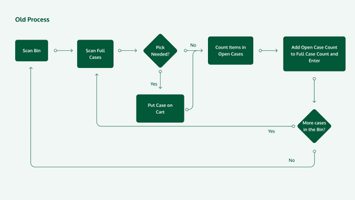
Our interviews and surveys indicated that the current system wasn't usable. We also discovered that the average time to complete the task was nearly twice the man-hours a store had each week.

Interviews

While visiting and working in stores, we interviewed many store associates to better understand the inventory process. These interviews helped us uncover critical insights, including why the system was mistrusted and largely ignored when making decisions.

Service Design

I created a service and journey map from these experiences and interviews, which helped us see the big picture and identify the largest opportunities.

SUS Scoring

We gave 15 store associates a survey and used the System Usability Score (SUS) rating to get a baseline measure of the effectiveness, efficiency, and satisfaction rating of the current system.


The system was rated as a 48, well below the average 68 score (on a scale of 0-100) that indicates an "OK" design.
Define

Using our service journey map, we identified and prioritized the most important problems to solve. We prioritized a list of ~15 major problems based on level of impact, downstream effects (multiple problems could likely be solved by solving a single problem), and how quickly we thought a problem could be solved.


We prioritized shortening a lengthy process, and building trust that the system was giving accurate information.

Lengthy Process

Associates didn't have enough time to complete the process accurately, creating incorrect data.

Lengthy Process

Associates didn't have enough time to complete the process accurately, creating incorrect data.

Lengthy Process

Associates didn't have enough time to complete the process accurately, creating incorrect data.

Trust

Associates didn't trust the system to give them accurate instructions, leading to inaccurate results and lost time.

Problem Statement

As a Walmart Associate working in the backroom, I need a way to quickly record inventory counts. I also need to be able to trust that the system is giving me accurate results.

Design

We focused our design efforts in 3 key areas: Backroom Environment, Technology, and User Interface.

Environment

Iterations

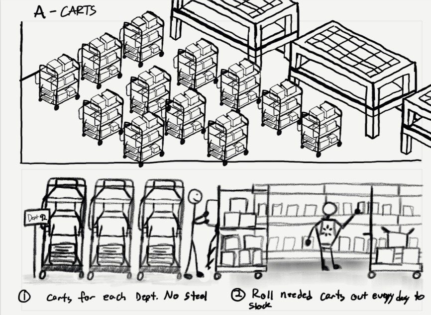
We prototyped different backroom and process configurations in multiple stores to design a shorter and more trustworthy process.

Iterations

We prototyped different backroom and process configurations in multiple stores to design a shorter and more trustworthy process.

Iterations

We prototyped different backroom and process configurations in multiple stores to design a shorter and more trustworthy process.

Solution

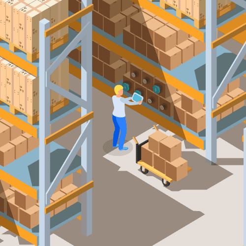
Ultimately we created an easier numbering system for backroom locations, including a way for AR devices to interact with backroom locations and inventory.

Solution

Ultimately we created an easier numbering system for backroom locations, including a way for AR devices to interact with backroom locations and inventory.

Solution

Ultimately we created an easier numbering system for backroom locations, including a way for AR devices to interact with backroom locations and inventory.

Technology

Iterations

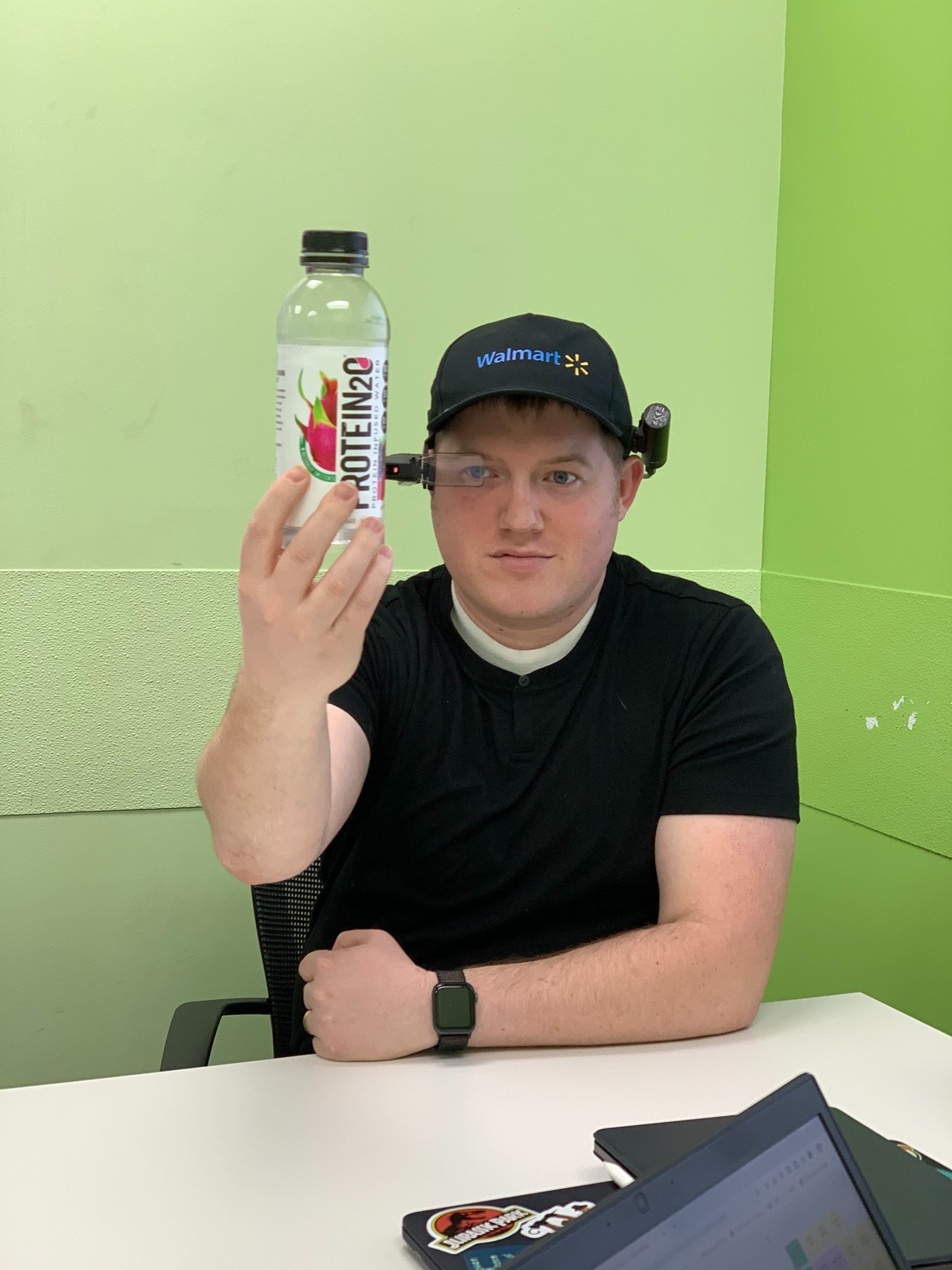
We tried out various levels of technology (including removing existing technology). We also explored different technology solutions like RFID, AR, and other hardware implementations.

Iterations

We tried out various levels of technology (including removing existing technology). We also explored different technology solutions like RFID, AR, and other hardware implementations.

Iterations

We tried out various levels of technology (including removing existing technology). We also explored different technology solutions like RFID, AR, and other hardware implementations.

Iterations

We tried out various levels of technology (including removing existing technology). We also explored different technology solutions like RFID, AR, and other hardware implementations.

Solution

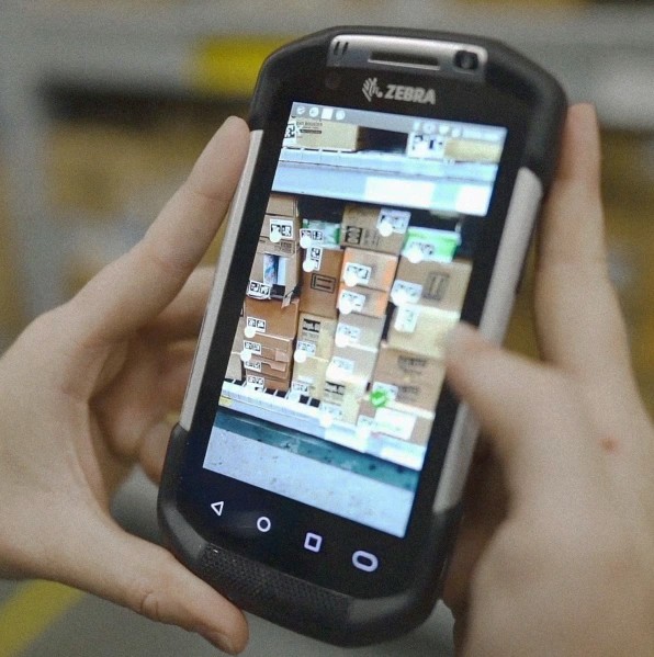
Removing the mobile devices turned a couple departments into chaos for a couple weeks. AR headsets were a cool idea, but ultimately too costly. We ultimately decided to build an AR experience built for the existing handheld device.

Solution

Removing the mobile devices turned a couple departments into chaos for a couple weeks. AR headsets were a cool idea, but ultimately too costly. We ultimately decided to build an AR experience built for the existing handheld device.

Solution

Removing the mobile devices turned a couple departments into chaos for a couple weeks. AR headsets were a cool idea, but ultimately too costly. We ultimately decided to build an AR experience built for the existing handheld device.

Solution

Removing the mobile devices turned a couple departments into chaos for a couple weeks. AR headsets were a cool idea, but ultimately too costly. We ultimately decided to build an AR experience built for the existing handheld device.

User Interface

Iterations

We had to achieve a balance of information density and minimalism. AR can be overwhelming to users, and it can be tricky to strike the right balance between too much and too little.

Iterations

We had to achieve a balance of information density and minimalism. AR can be overwhelming to users, and it can be tricky to strike the right balance between too much and too little.

Iterations

We had to achieve a balance of information density and minimalism. AR can be overwhelming to users, and it can be tricky to strike the right balance between too much and too little.

Iterations

We had to achieve a balance of information density and minimalism. AR can be overwhelming to users, and it can be tricky to strike the right balance between too much and too little.

Solution

We used a thumb-sized marker to indicate that the device read a box label. These markers would indicate whether action was needed on the box or not, and whether it had been picked by the user. The user could long press on any marker to see more information about the item.

Solution

We used a thumb-sized marker to indicate that the device read a box label. These markers would indicate whether action was needed on the box or not, and whether it had been picked by the user. The user could long press on any marker to see more information about the item.

Solution

We used a thumb-sized marker to indicate that the device read a box label. These markers would indicate whether action was needed on the box or not, and whether it had been picked by the user. The user could long press on any marker to see more information about the item.

Deliver

My primary deliverable was a Sketch document containing designs for engineering. I also built an Invasion prototype which we presented to key stakeholders in the business. Below are a sample of final UI screens.
Results

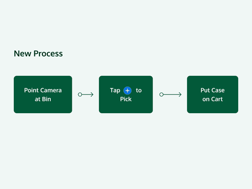
Our solution cut the time to complete this process down by 70%. I left the company before being able to redo the SUS survey, but early analysis was promising. Associate's report that it's much easier to count inventory, and that they trust the system to give accurate instructions.
© 2022 Nathan Crowther

© 2022 Nathan Crowther

© 2022 Nathan Crowther

© 2022 Nathan Crowther

LET'S CONNECT!